HOORAY for New Branding!
Today is the day!! I am beyond excited to share with you a project I've been working on the past few months... introducing the Happy Tines new branding and updated website! This has been a labor of love and it feels so good to reveal the new branding with you. YAY!
THE NEW BRANDING
I wanted the new branding to reflect the mission of Happy Tines which is simply to make people feel happy and special through happy paper goods. I started this business in 2016 as the result of needing a creative outlet from my corporate graphic design job, and since then Happy Tines has evolved and grown (thanks to my incredible clients and customers!!) not only from the services and products I offer, but my design and illustration style has evolved as well. I wanted the new branding to reflect the heart and personality that Happy Tines has evolved into and for the branding to allow for room to grow, too!
WHY I DECIDED TO DIY MY RE-BRAND
I decided to DIY my branding for a couple reasons:
- Hiring an expert to do an entire re-brand is a huge investment (and well worth it, I am sure!). I definitely considered hiring a super talented brand designer, but after some careful thought and research, I decided to DIY at this point in my business.
- What helped me immensely during this process was the 4-week Brand Challenge – thanks to a fellow creative entrepreneur, Lauren Hooker of Elle and Company! I didn’t think I had the time to DIY, but over the summer, I dedicated 30 minutes each evening to working on the steps in Lauren's printable workbook and slowly but surely, Happy Tines’ new branding started to come together. Lauren breaks down each part of the branding process into attainable steps, and it made the process seem not so overwhelming. I loved her tips along the way and I highly recommend to anyone considering to DIY a re-brand to check out Lauren's brand challenge. I’m so happy with how it turned out!
THE INSPIRATION BOARD
Here is the inspiration board that I created at the beginning of the process. I chose photos that accurately represented the vision for my brand (happy, positive, light-hearted, colorful, fun, modern – to name a few!). This inspiration board instantly makes me smile and feel happy which I think is a good sign!
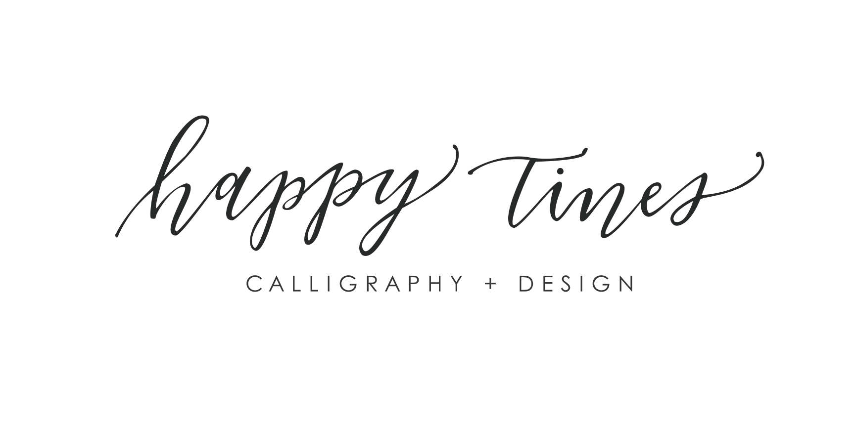
THE OLD LOGO
In July 2016, I officially launched Happy Tines, LLC and that was the start of my creative entrepreneurial journey. Having graduated with a BA in graphic design, I knew my way around Adobe Illustrator, so I created a logo that reflected my path at the time: a hand-written logo in my modern calligraphy style.
THE NEW LOGO
I wanted the new logo to be clean, simple, modern and easy to read. Because of this, I chose a very simple sans serif typeface. I added an envelope with happy accents incorporated into the icon design to add a bit of personality. The thin and thick lines that make up the happy accents represent the thin and thick strokes that are created when writing pointed-pen calligraphy.
THE COLOR PALETTE
I couldn’t be happier with the colors that I chose for the color palette! Truth be told, I’ve never put strict guidelines in place for my color palette in the past. This branding process really helped me be intentional about color and define what colors I want to use to distinguish my brand from others. I think out of all of the colors, the yellow is my personal favorite. What do you think?!
Thank you SO MUCH for being here and for being super supportive of my business! I wish I could pop through the screen and give you a gigantic hug right now. Your kind words and encouragement truly mean the world to me and I am so grateful for you! I have so many dreams in store for Happy Tines and this new branding is one completed baby step! With that said, feel free to take a look around the website and let me know what you think!
Cheers!
Caitlin


